English to Spanish Website Translation and Localisation
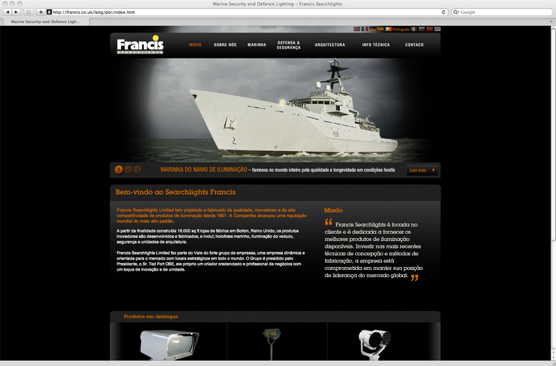
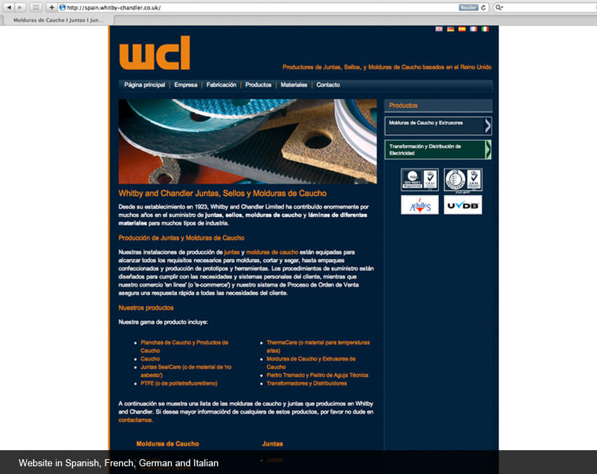
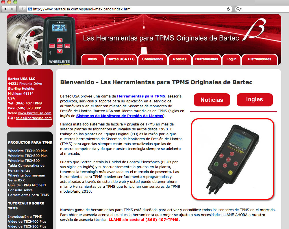
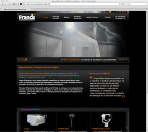
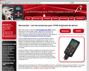
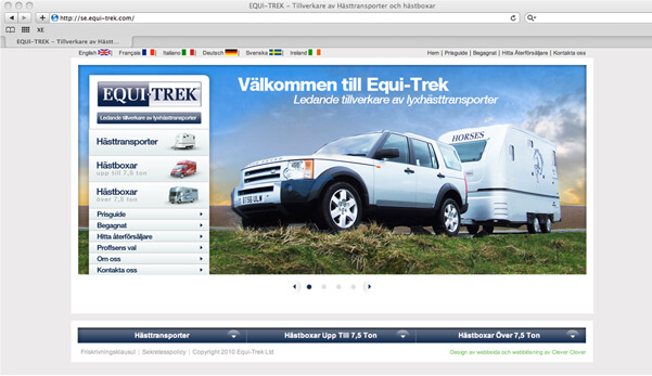
Spanish translation and localisation of websites for Francis and Whitby Chandler and a Mexican Spanish website for Bartec USA
Spanish website translation: How much of your site should be translated into Spanish?
Depending on how you are marketing your product or service abroad, it may not make sense or be cost-effective to translate the entire site into Spanish. If there are regularly updated sections such as ‘News’ or maybe a blog, in which new content is frequently added, you may want to exclude this from the Spanish version of your website. You can create an effective series of ‘mini-sites’ in Spanish, which contains the main content of your site.
Navigating your translated websites — to flag or not to flag?
Many companies like to use flags to show the languages into which their website is translated. Using the Spanish flag is common but bear in mind that some languages are spoken in multiple countries. If you are aiming for a generic translation to be understood by as many Spanish speakers as possible, then flags may not be appropriate.
Spanish language information
Spanish is the native language of 332 million people in the world. In addition to Spain, Spanish is the official language of Argentina, Bolivia, Chile, Colombia, Costa Rica, Cuba, the Dominican Republic, Ecuador, El Salvador, Equatorial Guinea, Guatemala, Honduras, Mexico, Nicaragua, Panama, Paraguay, Peru, Uruguay, and Venezuela. In addition, it is widely spoken in several other nations, including Canada, Morocco, the Philippines, and the United States
Spanish typesetting, voice-overs and subtitles
Adelphi Translations Ltd. can work from Spanish to English and English to Spanish. We also produce voice recordings and subtitles for videos, as well as the translation and localisation of printed materials into Spanish.
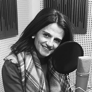
- Joanna RSpanish voice-over artist Joanna's voice is elegant and sensual and perfect for commercials, though Joanna has experience in many different voice-over projects including video games, IVR messages and e-learning.Angel BAngel is an expert in communication and a university graduate. He has more than thirty years of dedicating himself to the audio-visual production and voice-over work. He has his own studio and has worked for many companies of international prestige.AnaAna is a professional Spanish voice-over artist who has been active since 2007. Ana’s voice is versatile, clear and upbeat, and can be heard across a large selection of projects including advertisements, corporate videos, e-learning courses and more.
Website Translation — YouTube video with Captions
Sinhala (Sinhalese) desktop publishing and typesetting
Case study:
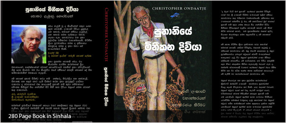
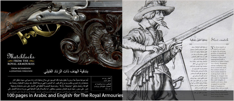
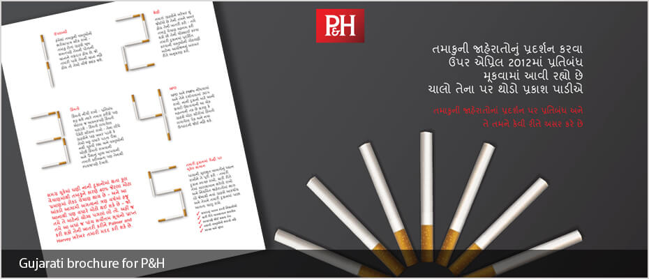
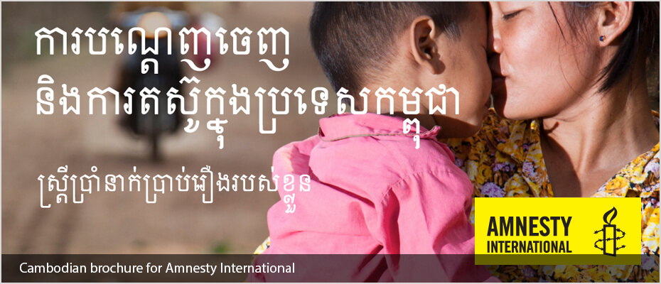
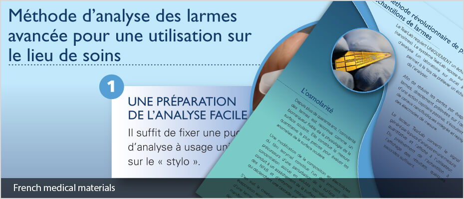
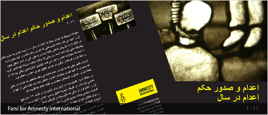
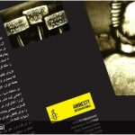
The above sample here is from a book we typeset in Sinhala called ‘The Man-Eater of Punanai’ by Christopher Ondaatje. This is the story of a small village in Ceylon where the locals were terrorised by a man-eating leopard. The other sample is of typesetting we carried out for Amnesty International.
Our Sinhala DTP and typesetting services include:
- Sinhala Document Translations
- Sinhala Proofreading
- Sinhala Desktop publishing and typesetting using all major publishing software
- Desktop publishing into over 100 languages
- Quality assurance checking throughout the process
- Localisation of graphics in documents
- Dedicated project manager
- Fast turnaround
- Print ready PDFs set to your specifications
- 100% work carried out in-house by our own DTP studio
Clients:
We work for companies and organisations such as Disney, Vidal Sassoon, and Jaguar Land Rover, to list a few. Plus international aid agencies such as Amnesty International, Refugee Action, UNICEF and the Refugee Council as well as many translation agencies and publishing companies all over the world.
A simple guide to localising InDesign files using translation software
By using an IDML file exported from InDesign we can speed up the translation and DTP process when using translation memory software. This method keeps all the formatting from the original InDesign file such as links, character and paragraph styles and fonts plus any interactive elements such as cross-references.
Click here to read more information
What is the difference between desktop publishing and typesetting
Simply stated, DTP (desktop publishing) and typesetting are the same. They both include putting the translated text into the original layout using software programs like InDesign, Quark, and Illustrator etc. Historically typesetting was just that, the setting of wood or metal type into blocks to print from. Desktop publishing was first developed at Xerox PARC in the 1970s and is often used to describe using a computer and software to set the type for publications.- Typesetting is also defined as: Typesetting is the process, the craft, of setting the type for a document, not to be confused with typography, which is the art of designing the type.
- Desktop publishing is also defined as The production of printed matter by means of a printer linked to a desktop computer, with special software.
Desktop publishing tips for localising English materials
- In some designs the pages are simply filled with text, leaving no room for text expansion. Most languages (with some notable exceptions) run longer than English and some of them run much longer. This causes the localised versions to have to make some sort of compromise: either text becomes smaller or a condensed font is used, or some material is completely cut out for brevity. Neither scenario is ideal, so it is much better to consider this aspect of the task at the design stage.
- Overuse of text formatting features such as drop caps, CAPITALISED TEXT, coloured text, bold text and italic text etc. can slow down the localisation process, as the formatting needs to be applied to the precise word or phrase in translation that is equivalent to the English. Sometimes, this does not work at all if the target language has a dramatically different word order.
- Embedded, non-editable text in images require extra attention and can slow things down dramatically, especially when over the main part of the image. Where possible, the text should be made available for editing in InDesign. If not, we will require all of the PSD files to work with.
- Avoid designing paragraphs or “word clouds” with mixed font sizes that look good in English but have no chance of being replicated in the target language: quite often they do not have the same impact when localised and can often be “lost in translation”. Furthermore, due to word order difference, keywords in English at the beginning of a sentence might end up in the middle or at the end of the sentence when translated.
- One of the most frequent issues we encounter is the incorrect and inconsistent usage of style sheets, in particular where one style has been used but in some instances, bold text, italics or even different fonts have been changed manually. This can cause significant delays in the localisation process.
- Sending the artwork to be typeset BEFORE it is signed off by the client is never a good idea, and neither are new design changes after we have already started the work. We can do nothing in situations like these where significant changes are requested mid-project but start again and present new figures for the work, delaying work and incurring further costs for the client.
English to Korean Website Translation and Localisation
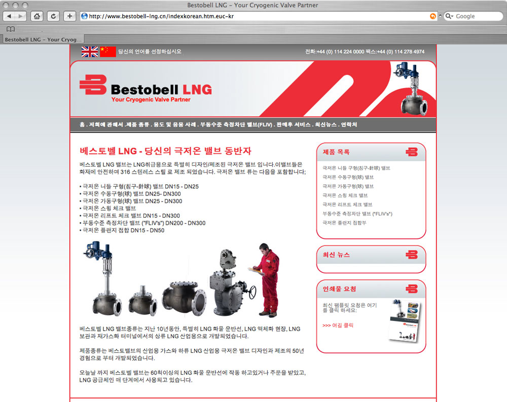
This Korean website translation which was carried out for Bestobell LNG. The website was also translated into Simplified Chinese (Mandarin).
Korean website translation: How much of your site should be translated into Korean?
Depending on how you are marketing your product or service abroad, it may not make sense or be cost-effective to translate the entire site into Korean. If there are regularly updated sections such as ‘News’ or maybe a blog, in which new content is frequently added, you may want to exclude this from the Korean version of your website. You can create an effective series of ‘mini-sites’ in Korean, which contains the main content of your site.
Navigating your translated websites — to flag or not to flag?
Many companies like to use flags to show the languages into which their website is translated. Using the Korean flag is common but bear in mind that some languages are spoken in multiple countries. If you are aiming for a generic translation to be understood by as many Korean speakers as possible, then flags may not be appropriate. For example, French in Europe is spoken in France, Belgium, Monaco, Andorra and Switzerland.
Korean language information
The Korean language is the official and national language of both Koreas: the Democratic People’s Republic of Korea (North Korea) and the Republic of Korea (South Korea), with different standardized official forms used in each territory.
Korean typesetting, voice-overs and subtitles
Adelphi Translations Ltd. can work from Korean to English and English to Korean. We also produce voice recordings and subtitles for videos, as well as the translation and localisation of printed materials into Korean.
- YunaYuna is a Korean professional voice over artist based in London, England. Yuna has been busy with playing various roles on stage & screen including ITV’s recent hit mini-series ‘Injustice’.TylerTyler is a Korean voice talent who was born and raised In Korea, he is currently living in Los Angeles, CA and working at Korean radio broadcast companies as a voiceover actor in LA Koreatown.
English to Dutch Website Translation and Localisation
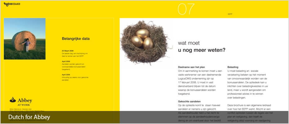
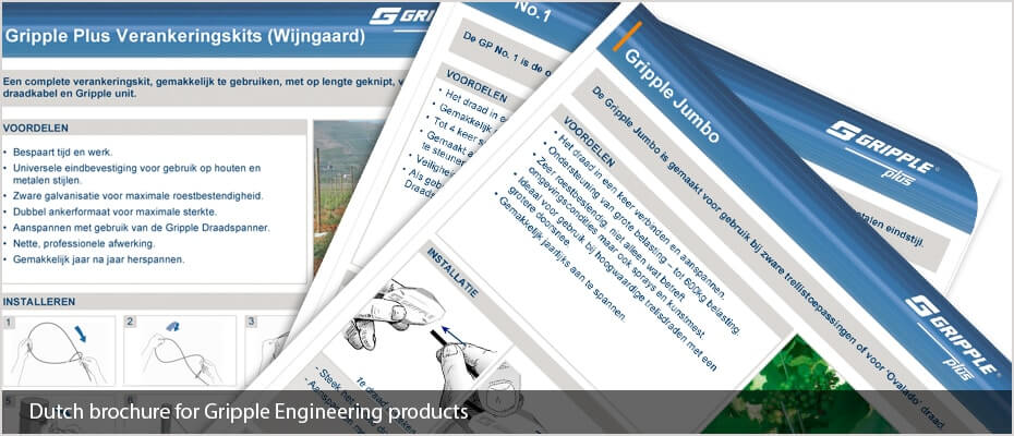
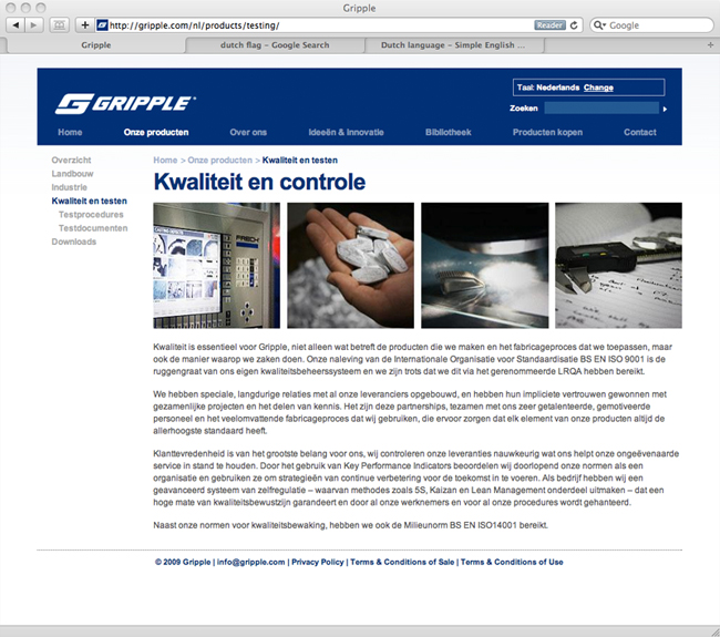
Below is a sample of our Dutch website translation, which we carried out for Gripple along with 7 other languages which included French, German, Italian, Polish, Portuguese, Russian and Spanish.
Dutch website translation: How much of your site should be translated into Dutch?
Depending on how you are marketing your product or service abroad, it may not make sense or be cost-effective to translate the entire site into Dutch. If there are regularly updated sections such as ‘News’ or maybe a blog, in which new content is frequently added, you may want to exclude this from the Dutch version of your website. You can create an effective series of ‘mini-sites’ in Dutch, which contains the main content of your site.
Navigating your translated websites — to flag or not to flag?
Many companies like to use flags to show the languages into which their website is translated. Using the Dutch flag is common but bear in mind that some languages are spoken in multiple countries. If you are aiming for a generic translation to be understood by as many Dutch speakers as possible, then flags may not be appropriate. For example, French in Europe is spoken in France, Belgium, Monaco, Andorra and Switzerland.
Dutch language information
The modern Dutch alphabet consists of the 26 letters of the ISO basic Latin alphabet and is used for the Dutch language. Five (or six) letters are vowels and 21 (or 20) letters are consonants. As well as the Latin script Dutch contains a digraph, ‘IJ’, which was once written Y, a letter which is now mainly used in foreign loanwords.
Dutch typesetting, voice-overs and subtitles
Adelphi Translations Ltd. can work from Dutch to English and English to Dutch. We also produce voice recordings and subtitles for videos, as well as the translation and localisation of printed materials into Dutch.
- MikeMike's been a Dutch actor/voice-over for over 22 years. His strongest point is the fact that he's a very experienced voice-over and actor as well. That combination works very well for explaining videos, testimonials, dialogues, and naturally spoken texts.PetraPetra is a multilingual voice-over talent with a warm, soothing, international sound. Petra provides native Dutch, French, and neutral European English voiceovers, particularly well adapted to convey your message to a global audience.
English into Japanese Website Translation and Localisation
We have our own in-house Japanese project manager who handles all of our Japanese translation and localisation projects.
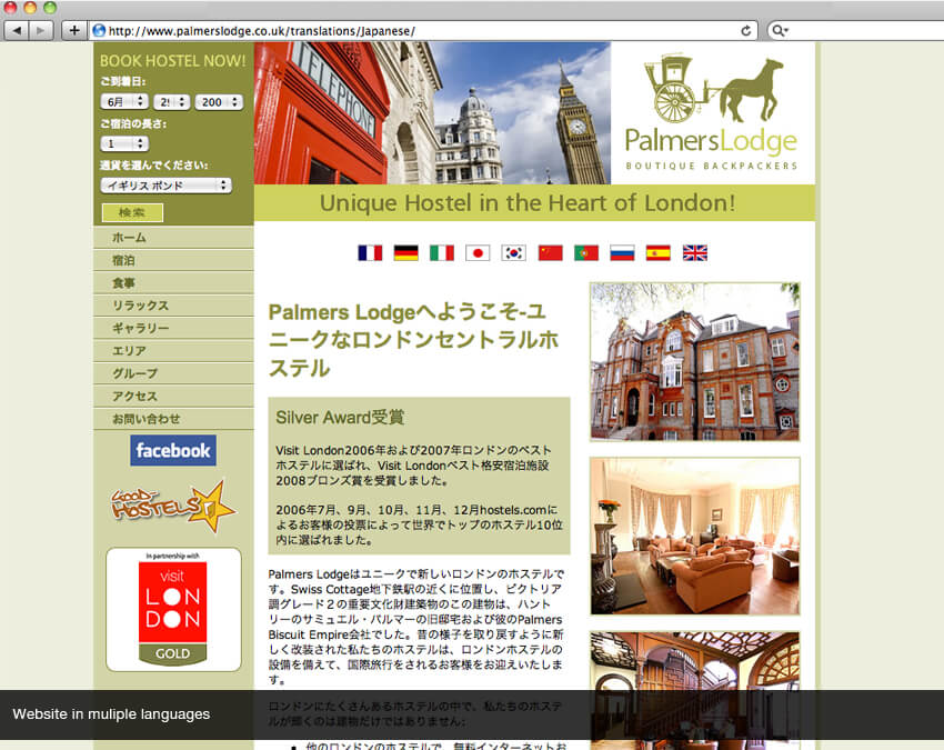
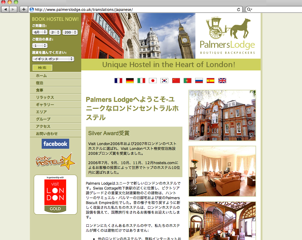
Below is a sample of a Japanese website translation that we carried out for Palmers Lodge along with 8 other languages which included French, German, Italian, Korean, Mandarin (Simplified Chinese), Portuguese, Russian and Spanish.
Japanese website translation: How much of your site should be translated into Japanese?
Depending on how you are marketing your product or service abroad, it may not make sense or be cost-effective to translate the entire site into Japanese. If there are regularly updated sections such as ‘News’ or maybe a blog, in which new content is frequently added, you may want to exclude this from the Japanese version of your website. You can create an effective series of ‘mini-sites’ in Japanese, which contains the main content of your site.
Japanese language information
Many languages expand when compared to English however Japanese on average tends to be shorter than English. Japanese uses “double-byte” characters: in terms of presentation, this means that punctuation marks like full-stops and commas have an extra, thin space coded right after them, e.g. 史上、重要。We are often asked to remove these by clients less familiar with Japanese, but this is both impossible and undesirable: these spaces are a natural part of digitally-presented Japanese.
Japanese desktop publishing, voice-overs, and subtitles
Adelphi Translations Ltd. can work from Japanese to English and English to Japanese. We also produce voice recordings and subtitles for videos, as well as the translation and localisation of printed materials into Japanese.
- ReikoJapanese voice artist Reiko has over 25 years as a Japanese TV & Radio Broadcaster, Narrator and Character Voice Talent in Tokyo and Canada. Recent Clients are Novartis, Hewlett Packard, Axis Network and Dance Central Spotlight.MasashiMasashi is a multi-skilled Japanese voice artist and performer. Recently Masashi has voiced the show Things Talk for BBC Three and featured in Banzai for Channel 4.
English to Chinese Website Translation and Localisation
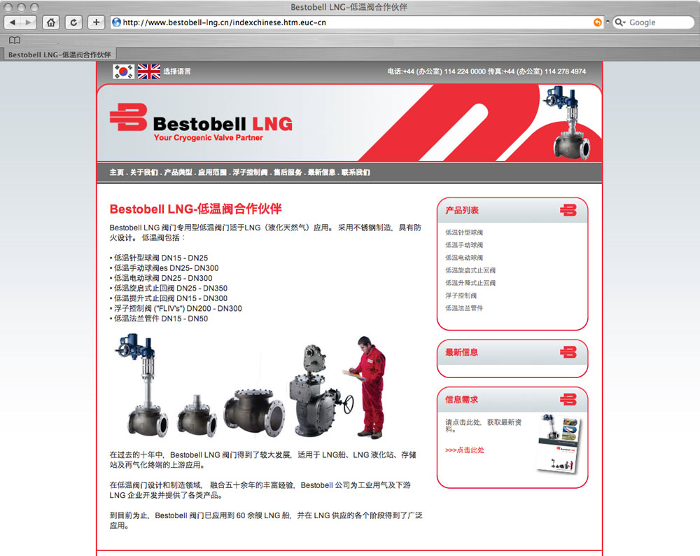
Below is an example of a Chinese website translation which we carried out for Bestobell LNG. The website was also translated into Korean.
Chinese website translation: How much of your site should be translated into Chinese?
Depending on how you are marketing your product or service abroad, it may not make sense or be cost-effective to translate the entire site into Chinese. If there are regularly updated sections such as ‘News’ or maybe a blog, in which new content is frequently added, you may want to exclude this from the Chinese version of your website. You can create an effective series of ‘mini-sites’ in Chinese, which contains the main content of your site.
Chinese website translation: to flag or not to flag?
Many companies like to use flags to show the languages their website is translated into. Using the Chinese flag is common but bear in mind that some languages are spoken across boundaries and if you are aiming for a ‘generic’ translation then flags would be less appropriate. For example, Chinese (Mandarin) is spoken in Mainland China, Hong Kong, Singapore, Taiwan and Malaysia.
Chines language information
Chinese is written using one of two character sets: “Simplified”, which is used in Mainland China and “Traditional”, which sees use in Taiwan, Hong Kong and Macau. The language and script you use depends on the area of China you are targeting. If you are not sure which you require, then feel free to speak to one of our Chinese-speaking project managers who will be able to advise you.
When translating your website into Chinese one of the things you have to consider is that the Chinese language is much shorter than English. If you are designing a website in English that you know is to be translated into Chinese, text contraction should be taken into consideration in the design stage.
Chinese typesetting, Chinese voice-overs and Chinese subtitles
Adelphi Translations Ltd. work translating Chinese to English and English to Chinese. We also produce Chinese voice recordings and Chinese subtitles for video as well as translation and localisation of printed materials into Chinese. We also translate from Chinese into English in all these areas.
- ZhenyuZhenyu is one of our most popular Chinese voice artists, we have had the pleasure of working with him on a number of projects. He is highly professional and always strives to provide the best quality Chinese voice-over recordings.Lily PChinese voice-over artist Lily has a sweet, friendly, smooth, warm and pleasant voice. She is a full-time voice talent for 8 years and is able to do a different range of ages from teenager to middle-age woman, Lily is also fluent in Mandarin and Cantonese Chinese.Aimee L
English to Portuguese Website Translation
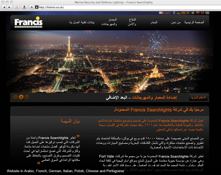
Below is a sample of a Portuguese website translation which we carried out for Francis along with 7 other languages which included Arabic, Cantonese (Traditional Chinese), French, German, Italian, Russian and Spanish.
Portuguese website translation: How much of your site should be translated into Portuguese?
Depending on how you are marketing your product or service abroad, it may not make sense or be cost-effective to translate the entire site into Portuguese. If there are regularly updated sections such as ‘News’ or maybe a blog, in which new content is frequently added, you may want to exclude this from the Portuguese version of your website. You can create an effective series of ‘mini-sites’ in Portuguese, which contains the main content of your site.
Navigating your translated websites — to flag or not to flag?
Many companies like to use flags to show the languages into which their website is translated. Using the Portuguese flag is common but bear in mind that some languages are spoken in multiple countries. If you are aiming for a generic translation to be understood by as many Portuguese speakers as possible, then flags may not be appropriate. For example, Portuguese is spoken in Portugal, Brazil, Mozambique, Angola and São Tomé.
Portuguese language information
Until recently, there were only 23 letters in the Portuguese alphabet (not including diacritics). The other 3 letters of the English alphabet were viewed as ‘foreign’ in Portuguese, but they were still used for certain ‘imported’ words such as ‘whiskey’ (they sometimes spell this more phonetically using their own alphabet: ‘uísque’). Since the 1990 orthographic agreement between Brazil and Portugal went into effect though the ‘w’, ‘k’, and ‘y’ are now officially included.
Portuguese typesetting, voice-overs and subtitles
Adelphi Translations Ltd. can work from Portuguese to English and English to Portuguese. We also produce voice recordings and subtitles for videos, as well as the translation and localisation of printed materials into Portuguese.
- TeresaTeresa has 28 years of experience as a voice-over artist, as well as experience as a television and radio presenter. Her voice can be described as warm, sensual and energetic.ArcindoPortuguese speaking voice artist Arcindo has been a professional voice-over artist and audio producer for sixteen years and can be heard daily on television and radio commercials across Portugal, Mozambique, Cape Verde, and Angola.
Dutch desktop publishing and typesetting services
Our Dutch DTP and typesetting services include:
- Dutch Document Translations
- Dutch Proofreading
- Dutch Desktop publishing and typesetting using all major publishing software
- Desktop publishing into over 120 languages
- Quality assurance checking throughout the process
- Localisation of graphics in documents
- Dedicated project manager
- Fast turnaround
- Print ready PDFs set to your specifications
- 100% work carried out In-house by our own DTP studio
Clients:
We work for companies and organisations such as Disney, Vidal Sassoon, and Jaguar Land Rover, to list a few. Plus international aid agencies such as Amnesty International, Refugee Action, UNICEF and the Refugee Council as well as many translation agencies and publishing companies all over the world.
A simple guide to localising InDesign files using translation software
By using an IDML file exported from InDesign we can speed up the translation and DTP process when using translation memory software. This method keeps all the formatting from the original InDesign file such as links, character and paragraph styles and fonts plus any interactive elements such as cross-references.
What is the difference between desktop publishing and typesetting
Simply stated, DTP (desktop publishing) and typesetting are the same. They both include putting the translated text into the original layout using software programs like InDesign, Quark, and Illustrator etc. Historically typesetting was just that, the setting of wood or metal type into blocks to print from. Desktop publishing was first developed at Xerox PARC in the 1970s and is often used to describe using a computer and software to set the type for publications.- Typesetting is also defined as: Typesetting is the process, the craft, of setting the type for a document, not to be confused with typography, which is the art of designing the type.
- Desktop publishing is also defined as The production of printed matter by means of a printer linked to a desktop computer, with special software.
Desktop publishing tips for localising English materials
- In some designs the pages are simply filled with text, leaving no room for text expansion. Most languages (with some notable exceptions) run longer than English and some of them run much longer. This causes the localised versions to have to make some sort of compromise: either text becomes smaller or a condensed font is used, or some material is completely cut out for brevity. Neither scenario is ideal, so it is much better to consider this aspect of the task at the design stage.
- Overuse of text formatting features such as drop caps, CAPITALISED TEXT, coloured text, bold text and italic text etc. can slow down the localisation process, as the formatting needs to be applied to the precise word or phrase in translation that is equivalent to the English. Sometimes, this does not work at all if the target language has a dramatically different word order.
- Embedded, non-editable text in images require extra attention and can slow things down dramatically, especially when over the main part of the image. Where possible, the text should be made available for editing in InDesign. If not, we will require all of the PSD files to work with.
- Avoid designing paragraphs or “word clouds” with mixed font sizes that look good in English but have no chance of being replicated in the target language: quite often they do not have the same impact when localised and can often be “lost in translation”. Furthermore, due to word order difference, keywords in English at the beginning of a sentence might end up in the middle or at the end of the sentence when translated.
- One of the most frequent issues we encounter is the incorrect and inconsistent usage of style sheets, in particular where one style has been used but in some instances, bold text, italics or even different fonts have been changed manually. This can cause significant delays in the localisation process.
- Sending the artwork to be typeset BEFORE it is signed off by the client is never a good idea, and neither are new design changes after we have already started the work. We can do nothing in situations like these where significant changes are requested mid-project but start again and present new figures for the work, delaying work and incurring further costs for the client.
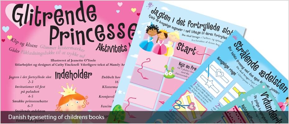
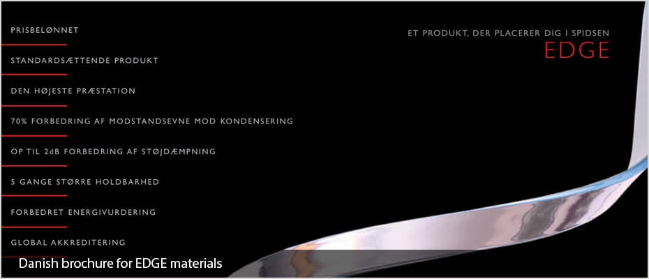
Danish desktop publishing and typesetting services
Our DTP and typesetting services include:
- Danish Document Translations
- Danish Proofreading
- Danish Desktop publishing and typesetting using all major publishing software
- Desktop publishing into over 120 languages
- DTP quality assurance checking of documents
- Localisation of graphics in documents
- Dedicated project manager
- Fast turnaround
- Print ready PDFs set to your specifications
- 100% work carried out In-house by our own DTP studio
Clients:
We work for companies and organisations such as Disney, Vidal Sassoon, and Jaguar Land Rover, to list a few. Plus international aid agencies such as Amnesty International, Refugee Action, UNICEF and the Refugee Council as well as many translation agencies and publishing companies all over the world.
A simple guide to localising InDesign files using translation software
By using an IDML file exported from InDesign we can speed up the translation and DTP process when using translation memory software. This method keeps all the formatting from the original InDesign file such as links, character and paragraph styles and fonts plus any interactive elements such as cross-references.
Click here to read more information
What is the difference between desktop publishing and typesetting
Simply stated, DTP (desktop publishing) and typesetting are the same. They both include putting the translated text into the original layout using software programs like InDesign, Quark, and Illustrator etc. Historically typesetting was just that, the setting of wood or metal type into blocks to print from. Desktop publishing was first developed at Xerox PARC in the 1970s and is often used to describe using a computer and software to set the type for publications.- Typesetting is also defined as: Typesetting is the process, the craft, of setting the type for a document, not to be confused with typography, which is the art of designing the type.
- Desktop publishing is also defined as The production of printed matter by means of a printer linked to a desktop computer, with special software.
Desktop publishing tips for localising English materials
- In some designs the pages are simply filled with text, leaving no room for text expansion. Most languages (with some notable exceptions) run longer than English and some of them run much longer. This causes the localised versions to have to make some sort of compromise: either text becomes smaller or a condensed font is used, or some material is completely cut out for brevity. Neither scenario is ideal, so it is much better to consider this aspect of the task at the design stage.
- Overuse of text formatting features such as drop caps, CAPITALISED TEXT, coloured text, bold text and italic text etc. can slow down the localisation process, as the formatting needs to be applied to the precise word or phrase in translation that is equivalent to the English. Sometimes, this does not work at all if the target language has a dramatically different word order.
- Embedded, non-editable text in images require extra attention and can slow things down dramatically, especially when over the main part of the image. Where possible, the text should be made available for editing in InDesign. If not, we will require all of the PSD files to work with.
- Avoid designing paragraphs or “word clouds” with mixed font sizes that look good in English but have no chance of being replicated in the target language: quite often they do not have the same impact when localised and can often be “lost in translation”. Furthermore, due to word order difference, keywords in English at the beginning of a sentence might end up in the middle or at the end of the sentence when translated.
- One of the most frequent issues we encounter is the incorrect and inconsistent usage of style sheets, in particular where one style has been used but in some instances, bold text, italics or even different fonts have been changed manually. This can cause significant delays in the localisation process.
- Sending the artwork to be typeset BEFORE it is signed off by the client is never a good idea, and neither are new design changes after we have already started the work. We can do nothing in situations like these where significant changes are requested mid-project but start again and present new figures for the work, delaying work and incurring further costs for the client.
Adelphi Translations Limited is a company registered in England and Wales.
Company Number 06989736 · Registered Office Barnsley Digital Media Centre, County Way, Barnsley, S70 2JW, UK




 ">
">







 ">
"> ">
">


 ">
"> ">
">
 ">
"> ">
"> ">
">