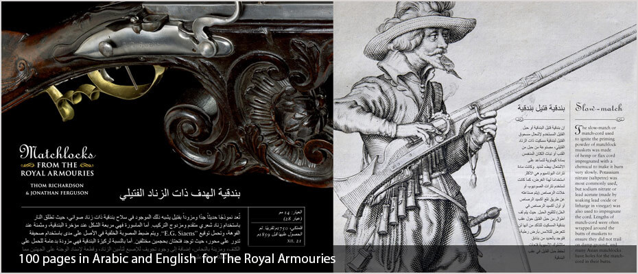
Slovak desktop publishing and typesetting services


Our Slovak DTP and typesetting services include:
- Slovak Document Translations
- Slovak Proofreading
- Slovak Desktop publishing and typesetting using all major publishing software
- Desktop publishing into over 100 languages
- Quality assurance checking throughout the process
- Localisation of graphics in documents
- Dedicated project manager
- Fast turnaround
- Print ready PDFs set to your specifications
- 100% work carried out In-house by our own DTP studio
Clients:
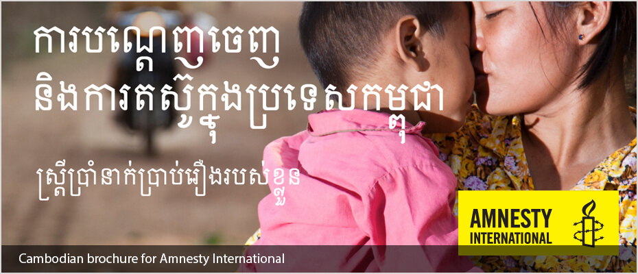
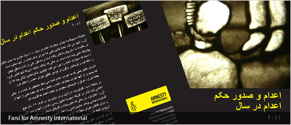
We work for companies and organisations such as Disney, Vidal Sassoon, and Jaguar Land Rover, to list a few. Plus international aid agencies such as Amnesty International, Refugee Action, UNICEF and the Refugee Council as well as many translation agencies and publishing companies all over the world.
A simple guide to localising InDesign files using translation software
By using an IDML file exported from InDesign we can speed up the translation and DTP process when using translation memory software. This method keeps all the formatting from the original InDesign file such as links, character and paragraph styles and fonts plus any interactive elements such as cross-references.
Click here to read more information
What is the difference between desktop publishing and typesetting
- Typesetting is also defined as: Typesetting is the process, the craft, of setting the type for a document, not to be confused with typography, which is the art of designing the type.
- Desktop publishing is also defined as The production of printed matter by means of a printer linked to a desktop computer, with special software.
Desktop publishing tips for localising English materials
- In some designs the pages are simply filled with text, leaving no room for text expansion. Most languages (with some notable exceptions) run longer than English and some of them run much longer. This causes the localised versions to have to make some sort of compromise: either text becomes smaller or a condensed font is used, or some material is completely cut out for brevity. Neither scenario is ideal, so it is much better to consider this aspect of the task at the design stage.
- Overuse of text formatting features such as drop caps, CAPITALISED TEXT, coloured text, bold text and italic text etc. can slow down the localisation process, as the formatting needs to be applied to the precise word or phrase in translation that is equivalent to the English. Sometimes, this does not work at all if the target language has a dramatically different word order.
- Embedded, non-editable text in images require extra attention and can slow things down dramatically, especially when over the main part of the image. Where possible, the text should be made available for editing in InDesign. If not, we will require all of the PSD files to work with.
- Avoid designing paragraphs or “word clouds” with mixed font sizes that look good in English but have no chance of being replicated in the target language: quite often they do not have the same impact when localised and can often be “lost in translation”. Furthermore, due to word order difference, keywords in English at the beginning of a sentence might end up in the middle or at the end of the sentence when translated.
- One of the most frequent issues we encounter is the incorrect and inconsistent usage of style sheets, in particular where one style has been used but in some instances, bold text, italics or even different fonts have been changed manually. This can cause significant delays in the localisation process.
- Sending the artwork to be typeset BEFORE it is signed off by the client is never a good idea, and neither are new design changes after we have already started the work. We can do nothing in situations like these where significant changes are requested mid-project but start again and present new figures for the work, delaying work and incurring further costs for the client.

Romanian desktop publishing and typesetting services


Our Romanian DTP and typesetting services include:
- Romanian Document Translations
- Romanian Proofreading
- Romanian Desktop publishing and typesetting using all major publishing software
- Desktop publishing into over 100 languages
- Quality assurance checking throughout the process
- Localisation of graphics in documents
- Dedicated project manager
- Fast turnaround
- Print ready PDFs set to your specifications
- 100% work carried out in-house by our own DTP studio
Clients:
We work for companies and organisations such as Disney, Vidal Sassoon, and Jaguar Land Rover, to list a few. Plus international aid agencies such as Amnesty International, Refugee Action, UNICEF and the Refugee Council as well as many translation agencies and publishing companies all over the world.
A simple guide to localising InDesign files using translation software
By using an IDML file exported from InDesign we can speed up the translation and DTP process when using translation memory software. This method keeps all the formatting from the original InDesign file such as links, character and paragraph styles and fonts plus any interactive elements such as cross-references.
Click here to read more information
What is the difference between desktop publishing and typesetting
- Typesetting is also defined as: Typesetting is the process, the craft, of setting the type for a document, not to be confused with typography, which is the art of designing the type.
- Desktop publishing is also defined as The production of printed matter by means of a printer linked to a desktop computer, with special software.
Desktop publishing tips for localising English materials
- In some designs the pages are simply filled with text, leaving no room for text expansion. Most languages (with some notable exceptions) run longer than English and some of them run much longer. This causes the localised versions to have to make some sort of compromise: either text becomes smaller or a condensed font is used, or some material is completely cut out for brevity. Neither scenario is ideal, so it is much better to consider this aspect of the task at the design stage.
- Overuse of text formatting features such as drop caps, CAPITALISED TEXT, coloured text, bold text and italic text etc. can slow down the localisation process, as the formatting needs to be applied to the precise word or phrase in translation that is equivalent to the English. Sometimes, this does not work at all if the target language has a dramatically different word order.
- Embedded, non-editable text in images require extra attention and can slow things down dramatically, especially when over the main part of the image. Where possible, the text should be made available for editing in InDesign. If not, we will require all of the PSD files to work with.
- Avoid designing paragraphs or “word clouds” with mixed font sizes that look good in English but have no chance of being replicated in the target language: quite often they do not have the same impact when localised and can often be “lost in translation”. Furthermore, due to word order difference, keywords in English at the beginning of a sentence might end up in the middle or at the end of the sentence when translated.
- One of the most frequent issues we encounter is the incorrect and inconsistent usage of style sheets, in particular where one style has been used but in some instances, bold text, italics or even different fonts have been changed manually. This can cause significant delays in the localisation process.
- Sending the artwork to be typeset BEFORE it is signed off by the client is never a good idea, and neither are new design changes after we have already started the work. We can do nothing in situations like these where significant changes are requested mid-project but start again and present new figures for the work, delaying work and incurring further costs for the client.
Turkish Translation and Typesetting
We have over 10 years of experience working with Turkish language. Adelphi Translations Ltd. translate Turkish to English and English to Turkish. We can work on your Adobe Indesign, Adobe Framemaker, QuarkXPress or Microsoft Office files. To avoid any problems printing it is normal procedure to provide high quality print-ready PDFs.
When typesetting Turkish a Turkish font has to be used as Turkish has special characters such as an uppercase i but with a dot (Ä°). Turkish text also expands around 30% more than the English source so when typesetting Turkish it could cause problems if this has not been taken into account in the original design.
Adelphi Typesetting is our latest website with portfolios in over 60 languages
VIEW PORTFOLIOS

All our Turkish typesetting is handled in-house and carried out by our own experienced typesetters. We produce all kinds of Turkish typesetting including corporate brochures, packaging, business cards, posters and manuals.
Adelphi is a full service translation agency, which as well as producing Turkish translations also produces Turkish websites, Turkish subtitling and Turkish voice-overs and has with offices in the UK and USA. When typesetting some languages it is important to know which font works for that particular language in a particular design package. By using Adelphi for your translation and typesetting we will ensure that the correct font is used to avoid any problems at the typesetting stage.
Adelphi has been translating and typesetting Turkish and other languages for national and international companies including Jaguar, Vidal Sassoon, Cisco, Sony etc, direct or via their advertising and design agencies. We also work for international aid agencies such as Amnesty International, Refugee Action, UNICEF and the Refugee Council.
Adelphi has typeset documents in over 100 languages and have built up expertise in using InDesign, QuarkXpress, FrameMaker, Illustrator etc. as well as all Microsoft applications.
——————————————————————————————————————————————————————————————————
Malay Translation and Typesetting (DTP)
We have over 10 years of experience working with Malay language. Adelphi Translations Ltd. translate Malay to English and English to Malay. We can work on your Adobe Indesign, Adobe Framemaker, QuarkXPress or Microsoft Office files. To avoid any problems printing it is normal procedure to provide high quality print-ready PDFs. We also produce voice recordings and subtitles for video in Malay as well as translation, typesetting and localization of web sites into Malay.
Malay text expands around 10% more than the English source so when typesetting Malay it could cause problems if this has not been taken into account in the original design.
We are based in Sheffield, UK and handle language projects for local clients in commercial centres such as Leeds, Manchester, Birmingham, Glasgow and London but also have many International clients from around the world. All Malay typesetting at Adelphi is carried out in-house, no work is subcontracted out. Hence maintaining quality and confidentiality.
A recent project we produced in Malay was for Amnesty International.
Adelphi Typesetting is our latest website with portfolios in over 60 languages
VIEW PORTFOLIOS
 Typesetting in over 60 languages
All our Malay typesetting is handled in-house and carried out by our own experienced typesetters. We produce all kinds of Malay typesetting including corporate brochures, packaging, business cards, posters and manuals.
Adelphi is a full service translation agency, which as well as producing Malay translations also produces Malay websites, Malay subtitling and Malay voice-overs and has with offices in the UK and USA. When typesetting some languages it is important to know which font works for that particular language in a particular design package. By using Adelphi for your translation and typesetting we will ensure that the correct font is used to avoid any problems at the typesetting stage.
Adelphi has been translating and typesetting Malay and other languages for national and international companies including Jaguar, Vidal Sassoon, Cisco, Sony etc, direct or via their advertising and design agencies. We also work for international aid agencies such as Amnesty International, Refugee Action, UNICEF and the Refugee Council.
Adelphi has typeset documents in over 100 languages and have built up expertise in using InDesign, QuarkXpress, FrameMaker, Illustrator etc. as well as all Microsoft applications.
——————————————————————————————————————————————————————————————————
FIGS (French, Italian, German and Spanish) Desktop Publishing
FIGS (French, Italian, German and Spanish) are, in some cases, more difficult to typeset than Chinese or Arabic because of the expansion of text when translated from English.
French typesetting text expansion
French is the main culprit and can expand as much as 50% from the original English. Why would this be? The English language has a much larger vocabulary than French, drawing as it does on two entirely different sources (Latin + Germanic). The French language has also been much more strictly controlled by the Académie Française, which has tried to keep the language ‘pure’ and free from foreign influences. When studying French in the 80s I always remember the ‘correct’ equivalent for ‘weekend’. The commonly used ‘Le weekend‘ was frowned upon by the Academy and the official translation was ‘le congé au fin de la semaine‘, literally ‘the break at the end of the week’.
Non-romance languages also tend to combine nouns much more frequently than the Latin languages and new words are more warmly welcomed into the lexicon.
Basic grammatical differences also contribute to the expansion. The possessive ‘s’ in English requires more words in French: ‘Paul’s car’ becoming ‘La voiture de Paul’, ‘bigger’ becomes ‘plus grand’ etc.
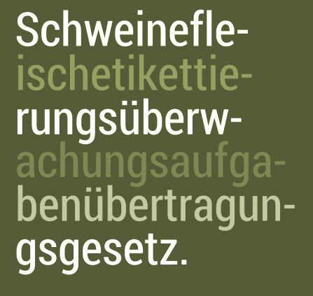
German text expansion – Compound words
One of the longest German words is Schweinefleischetikettierungsüberwachungsaufgabenübertragungsgesetz.
Which means the “legislative law for the monitoring of pork-meat labelling.” When typesetting German, compound words need to be hyphenated in the correct place.
Italian typesetting text expansion
In comparison, Italian is not such a problem as the text usually expands by about 10% and this can be resolved in the typesetting. You have to go back a long way to find the longest word in Italian. In 1677 the word precipitevolissimevolmente (as fast as possible), was coined.
Spanish typesetting text expansion
Spanish too does not expand so much and can usually be accommodated during the typesetting phase. If you want to be funny in Spanish, and linguistics at the same time, you can claim that the word ‘arroz’ is the longest in their language, because it starts with ‘a’ and ends with ‘z’. Who says linguists have no sense of humour?
FIGS and website translations
There is something to bear in mind if the translation is being produced for a website for these languages. Having text on images is generally a bad idea. Consider a button used on a web form or for navigation on a web site. The image is usually of a fixed length. If the translations into FIGS produces a longer word the image may have to remade. This will, at the least, be more costly or, at most, it may require a complete redesign of the web page or site.
So the general rule with FIGS is: text will expand. If the original English text and documents or web site are created with this in mind, it will save expense and hassle later on in the localisation process.
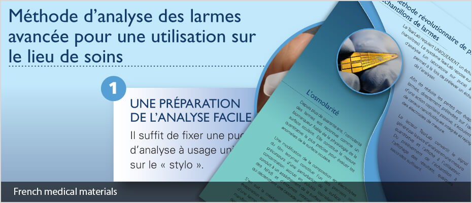
French desktop publishing and typesetting services


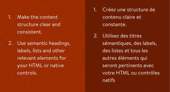
When text is translated from English to French one sentence might be of a very similar length while another could be double that. Here is an example:
Our French DTP services include:
- French Document Translations
- French Proofreading
- French Desktop publishing/typesetting using all major publishing software
- Desktop publishing in over 120 languages
- Quality assurance checking throughout the process
- Localisation of graphics in documents
- Dedicated project manager
- Fast turnaround
- Print-ready PDFs set to your specifications
- 100% work carried out in-house by our own DTP studio
Clients:
We work for companies and organisations such as Disney, Vidal Sassoon, and Jaguar Land Rover, to list a few. Plus international aid agencies such as Amnesty International, Refugee Action, UNICEF and the Refugee Council as well as many translation agencies and publishing companies all over the world.
A simple guide to localising InDesign files using translation software
By using an IDML file exported from InDesign we can speed up the translation and DTP process when using translation memory software. This method keeps all the formatting from the original InDesign file such as links, character and paragraph styles and fonts plus any interactive elements such as cross-references.
Click here to read more information
What is the difference between desktop publishing and typesetting
- Typesetting is also defined as: Typesetting is the process, the craft, of setting the type for a document, not to be confused with typography, which is the art of designing the type.
- Desktop publishing is also defined as: The production of printed matter by means of a printer linked to a desktop computer, with special software.
Desktop publishing tips for localising English materials
- In some designs the pages are simply filled with text, leaving no room for text expansion. Most languages (with some notable exceptions) run longer than English and some of them run much longer. This causes the localised versions to have to make some sort of compromise: either text becomes smaller or a condensed font is used, or some material is completely cut out for brevity. Neither scenario is ideal, so it is much better to consider this aspect of the task at the design stage.
- Overuse of text formatting features such as drop caps, CAPITALISED TEXT, coloured text, bold text and italic text etc. can slow down the localisation process, as the formatting needs to be applied to the precise word or phrase in translation that is equivalent to the English. Sometimes, this does not work at all if the target language has a dramatically different word order.
- Embedded, non-editable text in images require extra attention and can slow things down dramatically, especially when over the main part of the image. Where possible, the text should be made available for editing in InDesign. If not, we will require all of the PSD files to work with.
- Avoid designing paragraphs or “word clouds” with mixed font sizes that look good in English but have no chance of being replicated in the target language: quite often they do not have the same impact when localised and can often be “lost in translation”. Furthermore, due to word order difference, keywords in English at the beginning of a sentence might end up in the middle or at the end of the sentence when translated.
- One of the most frequent issues we encounter is the incorrect and inconsistent usage of style sheets, in particular where one style has been used but in some instances, bold text, italics or even different fonts have been changed manually. This can cause significant delays in the localisation process.
- Sending the artwork to be typeset BEFORE it is signed off by the client is never a good idea, and neither are new design changes after we have already started the work. We can do nothing in situations like these where significant changes are requested mid-project but start again and present new figures for the work, delaying work and incurring further costs for the client.
Brazilian Portuguese desktop publishing and typesetting services


Our Brazilian Portuguese DTP services include:
- Brazilian Portuguese Document Translations
- Brazilian Portuguese Proofreading
- Brazilian Portuguese Desktop publishing using all major publishing software
- Desktop publishing in over 120 languages
- DTP QA quality assurance checking of documents
- Localisation of graphics in documents
- Dedicated project manager
- Fast turnaround
- Print ready PDFs set to your specifications
- 100% work carried out In-house by our own DTP studio
Clients
We work for companies and organisations such as Disney, Vidal Sassoon, and Jaguar Land Rover, to list a few. Plus international aid agencies such as Amnesty International, Refugee Action, UNICEF and the Refugee Council as well as many translation agencies and publishing companies all over the world.
A simple guide to localising InDesign files using translation software
By using an IDML file exported from InDesign we can speed up the translation and DTP process when using translation memory software. This method keeps all the formatting from the original InDesign file such as links, character and paragraph styles and fonts plus any interactive elements such as cross-references.
Click here to read more information
What is the difference between desktop publishing and typesetting?
- Typesetting is also defined as: Typesetting is the process, the craft, of setting the type for a document, not to be confused with typography, which is the art of designing the type.
- Desktop publishing is also defined as The production of printed matter by means of a printer linked to a desktop computer, with special software.
Desktop publishing tips for localising English materials
- In some designs the pages are simply filled with text, leaving no room for text expansion. Most languages (with some notable exceptions) run longer than English and some of them run much longer. This causes the localised versions to have to make some sort of compromise: either text becomes smaller or a condensed font is used, or some material is completely cut out for brevity. Neither scenario is ideal, so it is much better to consider this aspect of the task at the design stage.
- Overuse of text formatting features such as drop caps, CAPITALISED TEXT, coloured text, bold text and italic text etc. can slow down the localisation process, as the formatting needs to be applied to the precise word or phrase in translation that is equivalent to the English. Sometimes, this does not work at all if the target language has a dramatically different word order.
- Embedded, non-editable text in images require extra attention and can slow things down dramatically, especially when over the main part of the image. Where possible, the text should be made available for editing in InDesign. If not, we will require all of the PSD files to work with.
- Avoid designing paragraphs or “word clouds” with mixed font sizes that look good in English but have no chance of being replicated in the target language: quite often they do not have the same impact when localised and can often be “lost in translation”. Furthermore, due to word order difference, keywords in English at the beginning of a sentence might end up in the middle or at the end of the sentence when translated.
- One of the most frequent issues we encounter is the incorrect and inconsistent usage of style sheets, in particular where one style has been used but in some instances, bold text, italics or even different fonts have been changed manually. This can cause significant delays in the localisation process.
- Sending the artwork to be typeset BEFORE it is signed off by the client is never a good idea, and neither are new design changes after we have already started the work. We can do nothing in situations like these where significant changes are requested mid-project but start again and present new figures for the work, delaying work and incurring further costs for the client.
Hindi desktop publishing and typesetting services


Our Hindi DTP and typesetting services include:
- Hindi Document Translations
- Hindi Proofreading
- Hindi Desktop publishing and typesetting using all major publishing software
- Desktop publishing into over 100 languages
- Quality assurance checking throughout the process
- Localisation of graphics in documents
- Dedicated project manager
- Fast turnaround
- Print ready PDFs set to your specifications
- 100% work carried out In-house by our own DTP studio
Clients:
We work for companies and organisations such as Disney, Vidal Sassoon, and Jaguar Land Rover, to list a few. Plus international aid agencies such as Amnesty International, Refugee Action, UNICEF and the Refugee Council as well as many translation agencies and publishing companies all over the world.
A simple guide to localising InDesign files using translation software
By using an IDML file exported from InDesign we can speed up the translation and DTP process when using translation memory software. This method keeps all the formatting from the original InDesign file such as links, character and paragraph styles and fonts plus any interactive elements such as cross-references.
Click here to read more information
What is the difference between desktop publishing and typesetting
- Typesetting is also defined as: Typesetting is the process, the craft, of setting the type for a document, not to be confused with typography, which is the art of designing the type.
- Desktop publishing is also defined as The production of printed matter by means of a printer linked to a desktop computer, with special software.
Desktop publishing tips for localising English materials
- In some designs the pages are simply filled with text, leaving no room for text expansion. Most languages (with some notable exceptions) run longer than English and some of them run much longer. This causes the localised versions to have to make some sort of compromise: either text becomes smaller or a condensed font is used, or some material is completely cut out for brevity. Neither scenario is ideal, so it is much better to consider this aspect of the task at the design stage.
- Overuse of text formatting features such as drop caps, CAPITALISED TEXT, coloured text, bold text and italic text etc. can slow down the localisation process, as the formatting needs to be applied to the precise word or phrase in translation that is equivalent to the English. Sometimes, this does not work at all if the target language has a dramatically different word order.
- Embedded, non-editable text in images require extra attention and can slow things down dramatically, especially when over the main part of the image. Where possible, the text should be made available for editing in InDesign. If not, we will require all of the PSD files to work with.
- Avoid designing paragraphs or “word clouds” with mixed font sizes that look good in English but have no chance of being replicated in the target language: quite often they do not have the same impact when localised and can often be “lost in translation”. Furthermore, due to word order difference, keywords in English at the beginning of a sentence might end up in the middle or at the end of the sentence when translated.
- One of the most frequent issues we encounter is the incorrect and inconsistent usage of style sheets, in particular where one style has been used but in some instances, bold text, italics or even different fonts have been changed manually. This can cause significant delays in the localisation process.
- Sending the artwork to be typeset BEFORE it is signed off by the client is never a good idea, and neither are new design changes after we have already started the work. We can do nothing in situations like these where significant changes are requested mid-project but start again and present new figures for the work, delaying work and incurring further costs for the client.
Amharic desktop publishing and typesetting services


Our Amharic DTP services include:
- Amharic Document Translations
- Amharic Proofreading
- Amharic Desktop publishing using all major publishing software
- Desktop publishing in over 120 languages
- Quality assurance checking throughout the process
- Localisation of graphics in documents
- Dedicated project manager
- Fast turnaround
- Print ready PDFs set to your specifications
- 100% work carried out In-house by our own DTP studio
Clients
We work for companies and organisations such as Disney, Vidal Sassoon, and Jaguar Land Rover, to list a few. Plus international aid agencies such as Amnesty International, Refugee Action, UNICEF and the Refugee Council as well as many translation agencies and publishing companies all over the world.
A simple guide to localising InDesign files using translation software
By using an IDML file exported from InDesign we can speed up the translation and DTP process when using translation memory software. This method keeps all the formatting from the original InDesign file such as links, character and paragraph styles and fonts plus any interactive elements such as cross-references.
Click here to read more information
What is the difference between desktop publishing and typesetting
- Typesetting is also defined as: Typesetting is the process, the craft, of setting the type for a document, not to be confused with typography, which is the art of designing the type.
- Desktop publishing is also defined as The production of printed matter by means of a printer linked to a desktop computer, with special software.
Desktop publishing tips for localising English materials
- In some designs the pages are simply filled with text, leaving no room for text expansion. Most languages (with some notable exceptions) run longer than English and some of them run much longer. This causes the localised versions to have to make some sort of compromise: either text becomes smaller or a condensed font is used, or some material is completely cut out for brevity. Neither scenario is ideal, so it is much better to consider this aspect of the task at the design stage.
- Overuse of text formatting features such as drop caps, CAPITALISED TEXT, coloured text, bold text and italic text etc. can slow down the localisation process, as the formatting needs to be applied to the precise word or phrase in translation that is equivalent to the English. Sometimes, this does not work at all if the target language has a dramatically different word order.
- Embedded, non-editable text in images require extra attention and can slow things down dramatically, especially when over the main part of the image. Where possible, the text should be made available for editing in InDesign. If not, we will require all of the PSD files to work with.
- Avoid designing paragraphs or “word clouds” with mixed font sizes that look good in English but have no chance of being replicated in the target language: quite often they do not have the same impact when localised and can often be “lost in translation”. Furthermore, due to word order difference, keywords in English at the beginning of a sentence might end up in the middle or at the end of the sentence when translated.
- One of the most frequent issues we encounter is the incorrect and inconsistent usage of style sheets, in particular where one style has been used but in some instances, bold text, italics or even different fonts have been changed manually. This can cause significant delays in the localisation process.
- Sending the artwork to be typeset BEFORE it is signed off by the client is never a good idea, and neither are new design changes after we have already started the work. We can do nothing in situations like these where significant changes are requested mid-project but start again and present new figures for the work, delaying work and incurring further costs for the client.
Albanian desktop publishing


Our DTP and typesetting services include:
- Albanian Document Translations
- Albanian Proofreading
- Albanian Desktop publishing using all major publishing software
- Desktop publishing into over 120 languages
- DTP quality assurance checking of documents
- Localisation of graphics in documents
- Dedicated project manager
- Fast turnaround
- Print ready PDFs set to your specifications
- 100% work carried out In-house by our own DTP studio
Clients
Adelphi works for companies and organisations such as Disney, Vidal Sassoon, and Jaguar Land Rover, to list a few. Plus international aid agencies such as Amnesty International, Refugee Action, UNICEF and the Refugee Council as well as many translation agencies and publishing companies all over the world.
A simple guide to localising InDesign files using translation software
By using an IDML file exported from InDesign we can speed up the translation and DTP process when using translation memory software. This method keeps all the formatting from the original InDesign file such as links, character and paragraph styles and fonts plus any interactive elements such as cross-references.
Click here to read more information
What is the difference between desktop publishing and typesetting?
Simply stated, DTP (desktop publishing) and typesetting are the same things. It is putting the translated text into the original layout using software programs like InDesign, Quark, Illustrator etc. Historically typesetting was just that, the setting of wood or metal type into blocks to print from. Desktop publishing was first developed at Xerox PARC in the 1970s and is often used to describe using a computer and software to set the type for publications.
- Typesetting is also defined as: Typesetting is the process, the craft, of setting the type for a document, not to be confused with typography, which is the art of designing the type.
- Desktop publishing is also defined as The production of printed matter by means of a printer linked to a desktop computer, with special software.
Desktop publishing tips for localising English printed materials
- In some designs the pages are simply filled with text, leaving no room for text expansion. Most languages (with some notable exceptions) run longer than English and some of them run much longer. This causes the localised versions to have to make some sort of compromise: either text becomes smaller or a condensed font is used, or some material is completely cut out for brevity. Neither scenario is ideal, so it is much better to consider this aspect of the task at the design stage.
- Overuse of text formatting features such as drop caps, CAPITALISED TEXT, coloured text, bold text and italic text etc. can slow down the localisation process, as the formatting needs to be applied to the precise word or phrase in translation that is equivalent to the English. Sometimes, this does not work at all if the target language has a dramatically different word order.
- Embedded, non-editable text in images require extra attention and can slow things down dramatically, especially when over the main part of the image. Where possible, the text should be made available for editing in InDesign. If not, we will require all of the PSD files to work with.
- Avoid designing paragraphs or “word clouds” with mixed font sizes that look good in English but have no chance of being replicated in the target language: quite often they do not have the same impact when localised and can often be “lost in translation”. Furthermore, due to word order difference, keywords in English at the beginning of a sentence might end up in the middle or at the end of the sentence when translated.
- One of the most frequent issues we encounter is the incorrect and inconsistent usage of style sheets, in particular where one style has been used but in some instances, bold text, italics or even different fonts have been changed manually. This can cause significant delays in the localisation process.
- Sending the artwork to be typeset BEFORE it is signed off by the client is never a good idea, and neither are new design changes after we have already started the work. We can do nothing in situations like these where significant changes are requested mid-project but start again and present new figures for the work, delaying work and incurring further costs for the client.
Adelphi Translations Limited is a company registered in England and Wales.
Company Number 06989736 · Registered Office Barnsley Digital Media Centre, County Way, Barnsley, S70 2JW, UK